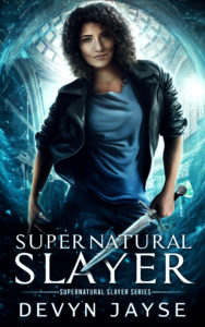
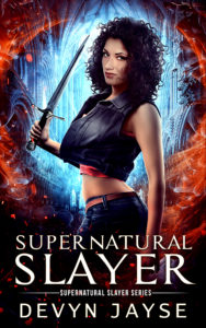
Supernatural Slayer has a new cover. I just updated the cover on KDP and the changes will appear within the next 72 hours.
I really liked the original cover and so did some readers and bloggers, but it had a distinct flaw. It didn’t stand out.
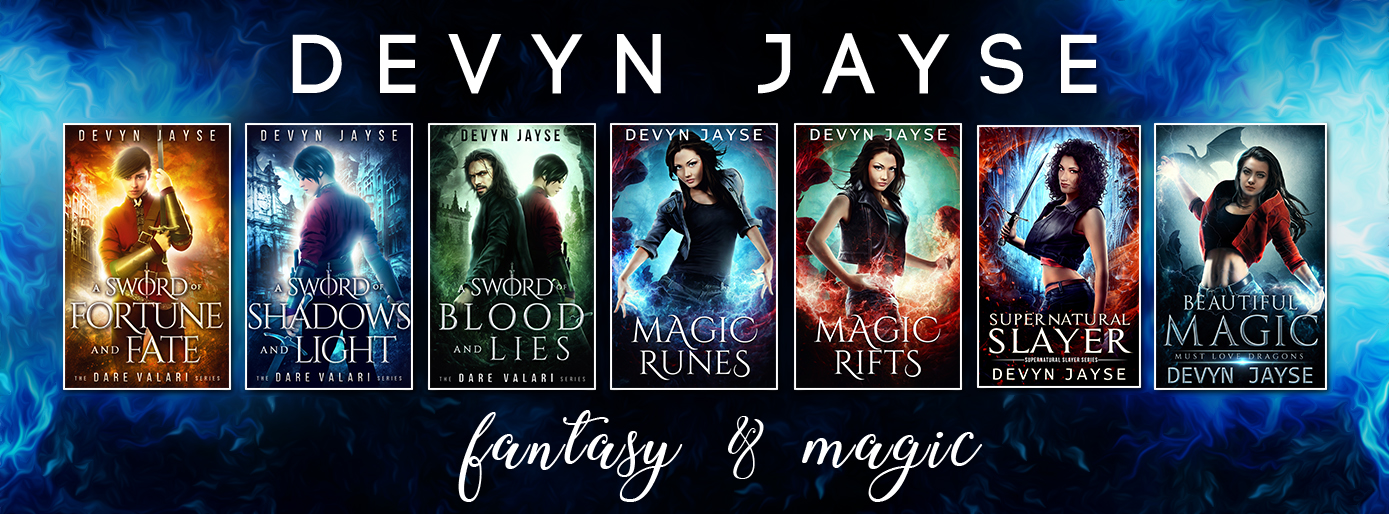
The lack of contrast of colors was an issue that made itself known when the book was displayed alongside others. It just wasn’t converting well next to other books. By that, I mean that I had AMS advertisements going for my three books (Magic Runes/Supernatural Slayer/Beautiful Magic) and Supernatural Slayer was performing the worst. It barely got any clicks despite a high number of impressions.
I knew it wasn’t the book itself since it has the highest number of reviews and most of the reviewers said they enjoyed the book. And that fact alone made me realize I was doing the book a disservice. I needed a new cover that got clicks. A one-click cover is the ultimate dream. It’s a cover that readers will purchase with one-click, no questions asked. Some barely read the blurb. A one-click cover is magical. You can attempt getting all the elements together but it doesn’t always come together the way you’d like. It was clear the original cover wasn’t it, but I needed a cover that got clicks.
I asked the original cover designer, Andrei Bat, to rework the cover of book 3 in the series, Shade Hunter, because I loved that one the most. He reversed the image and changed some elements, et voila, a new cover!
Before & After


I’m happy with the result but the true test will be when I start the AMS ads again and see how well the book converts with a new shiny cover. Will it get the clicks that I covet? Time will tell!
What do you think of the new cover? Let me know in the comments.


28 comments
Take old girl and put new background. New girl to sexy – wrong message.
Thanks Quilting Tangent for your feedback. I really appreciate it.
I like the new cover a lot. It shows character progression to me.
Thanks Gabriel!
I love the new cover!
I luv it!
Thanks Katina!
Thanks Latifa!
The old cover was alright, but the new one is so much better! I love the brighter, more focused looks of the new covers!
Thank you Laurie! I love the bright colors too 🙂
The new cover is brighter and the picture is more clear. Overall, the new cover is much more attractive.
Glad to hear you like it Melanie 😀
I like the new cover. Really catches the eye. Look forward to reading the series.
Thanks Renee! Happy reading!
The new cover really pops! I especially like the improvement to the hair and eyes.
Old. What’s with that vest/top? Hiding a couple DDD’s?
I like the new cover, but I prefer the more realistic look of the girl in the original cover.
I enjoy how the new colors make everything pop. Much better cover.
I really like the new cover! Definitely catches the eye more with the brighter colors. And I think the newer cover makes Aisha look more like she’s in her 20’s like she’s supposed to be.
I think the new cover is better, she looks more bad ***!
have not read books yet but new cover pops.
I love the new cover. It’s eye catching and the figure is sassy, a little sexy and beautifully proportioned. The colours are great too.
The new cover, her eyes and stanch makes her look more bad ass.
I like the new cover best. I never liked the old cover. The girl on the old cover seemed old.
I really like it. I thought at first that we were choosing between the 2 and I liked the new one right away. So you definitely made a great choice with the new cover.
Love the New Cover. Like the change to her hair, her expression and her eyes.
I like the new cover better. It better portrayes her daring, sexy self!
I really love the new cover, The old one was too dark and there is nothing attractive about the old girl. The new cover is bright and I love what you did with the colors and the brightness to her face and the new hair style…